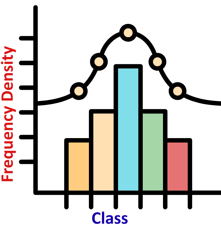
- A histogram is a graphical representation of numerical data that shows the frequency of values within specific intervals.
- The data is grouped into continuous ranges (called bins), and bars are used to display how many data points fall into each range. Unlike bar graphs, the bars in a histogram touch, indicating continuous data.
For Example:
- A Frequency density is used when data is grouped into classes (intervals), and those classes have different widths. It tells us how packed the data is within each class.

Terms related to the concept of Histograms:
- Class Interval (or Bin)-
A range of values (like 0–10, 10–20) into which data is grouped.
- Frequency-
The number of data points that fall into a particular class interval.
- Frequency Density-
Used when class widths are unequal.
- Class Width-
The difference between the upper and lower boundary of a class.
Example: For 10 –20, the class width is 10.
- Frequency density helps when your class intervals (group ranges) are not all equal. Here’s how you calculate it:
Steps to Work It Out:
- Step#1: Identify the Frequency
This is how many values fall into each class interval.
- Step#2: Find the Class Width
Class Width = (Upper Limit−Lower Limit)
- Step#3: Use the Formula to find Frequency Density
Divide frequency by class width for each class
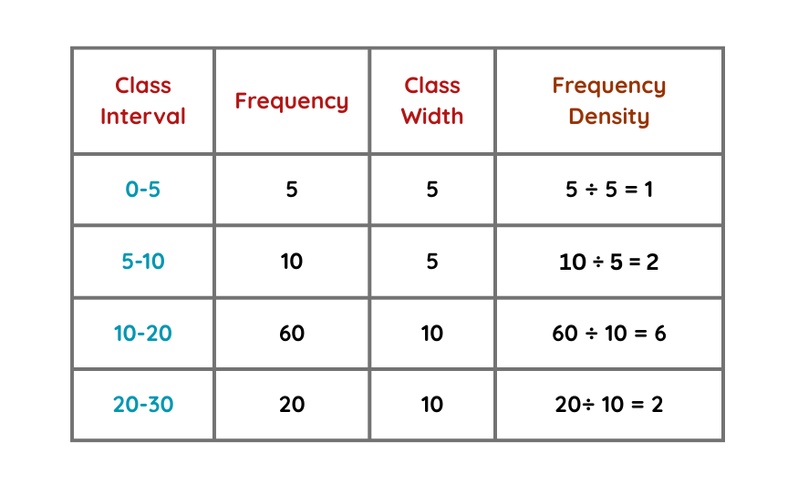
Example Table: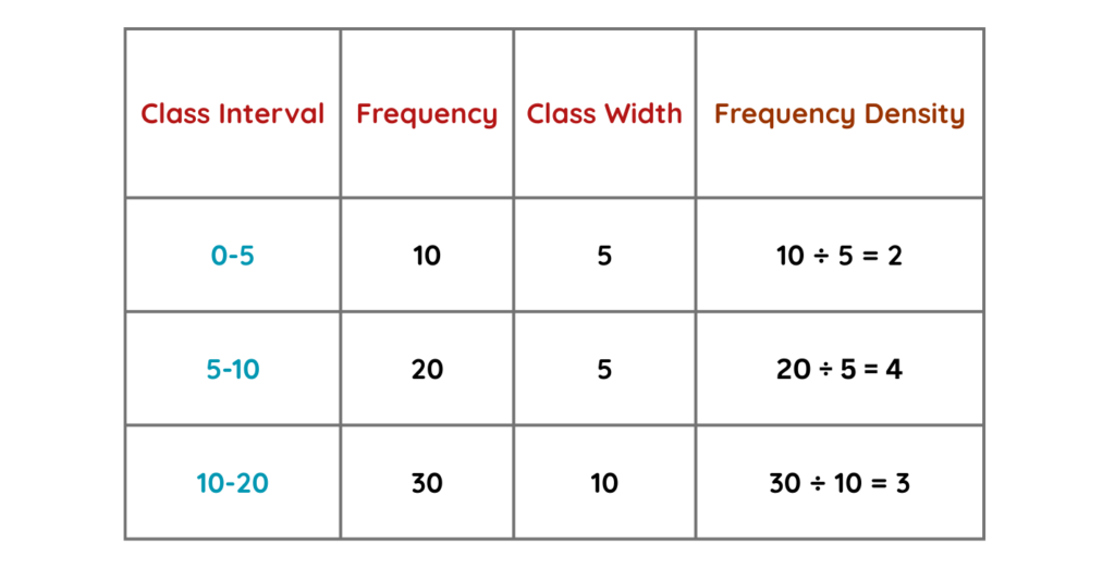
 Solved Example:
Example: Construct a histogram for the following data.
 Solution:
Step #1: Identify the Frequency:
- This is how many values fall into each class interval.
Step #2: Find the Class Width:
Class Width = (Upper Limit−Lower Limit)
Class Width-

Let us take a note that there is no need to calculate Frequency density when class width of each and every interval comes out to be same.
Step #3: Use the Formula:
- Divide frequency by class width for each class but as here the class width of all the class intervals is same. Thus, we will take frequency as frequency density.
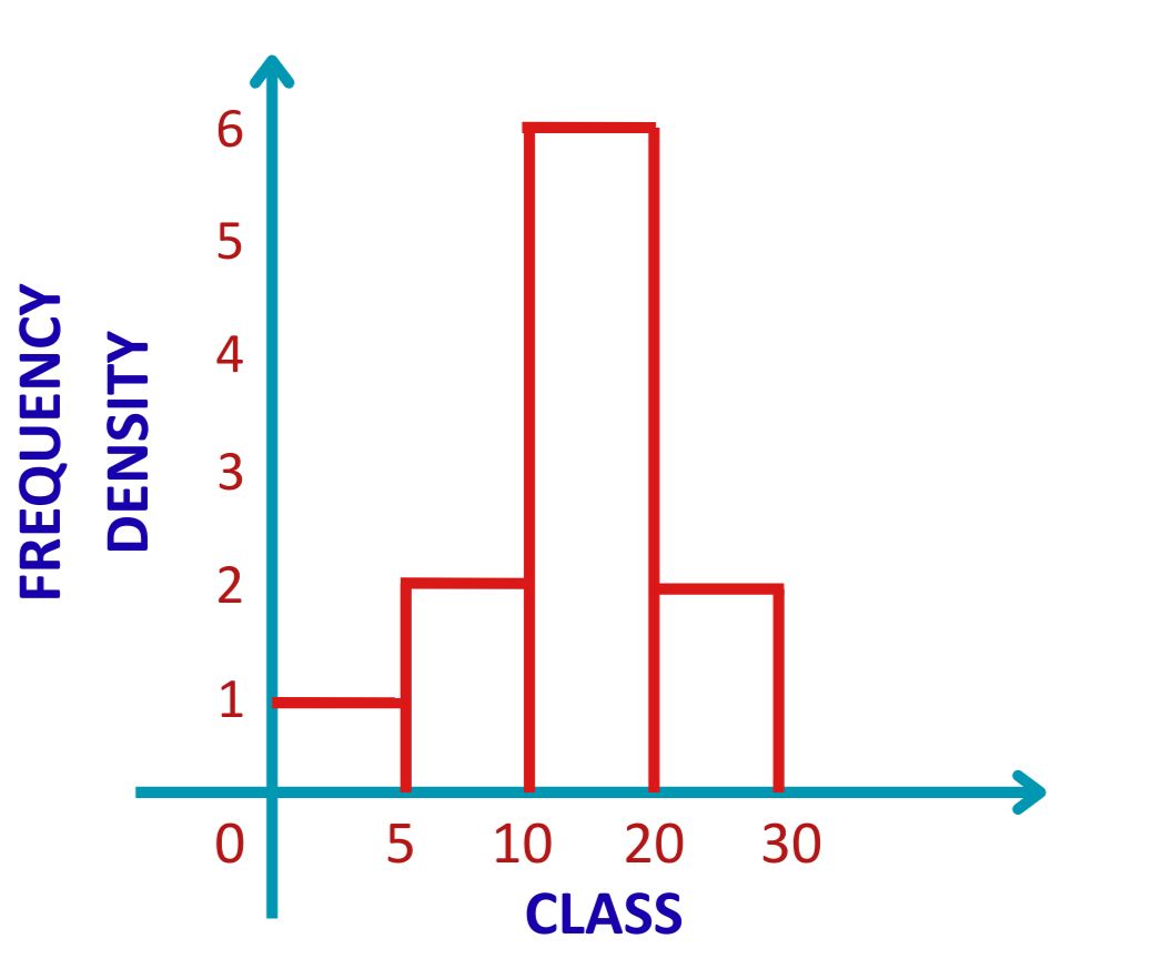
- Hence, by the help of the table given to us, let us construct the histogram of the given data.
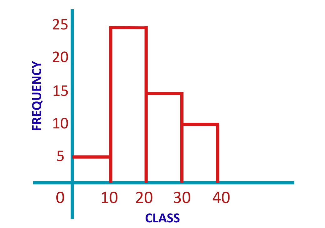
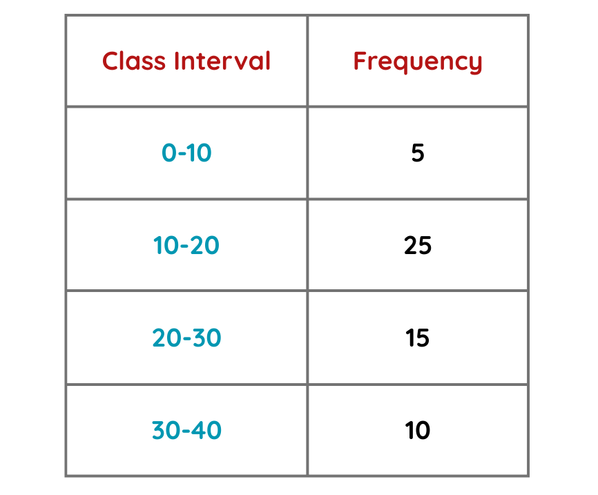
Solved Example:
Example: Construct a histogram for the following data.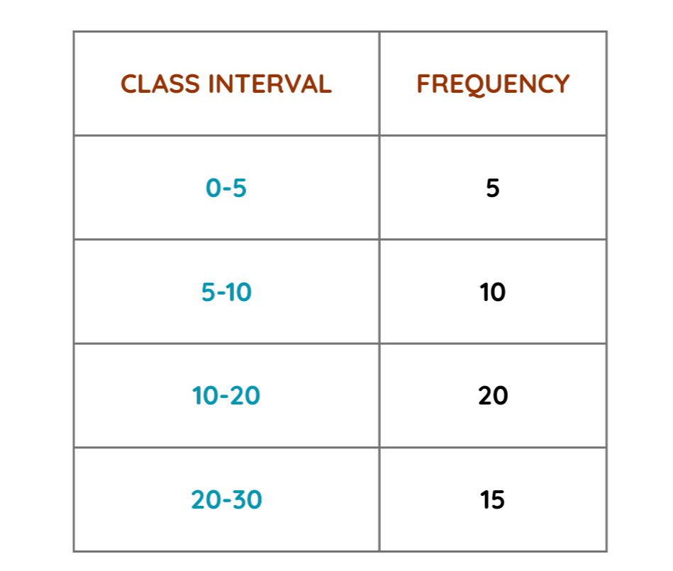 Solution:
Step #1: Identify the Frequency:
- This is how many values fall into each class interval.
Step #2: Find the Class Width:
Class Width = (Upper Limit−Lower Limit)
Step #3: Use the Formula:
- Divide frequency by class width for each class in order to find Frequency Density.
- Let us find the Frequency densities of the respective class intervals.
- Hence, by the help of the table given to us, let us construct the histogram of the given data.
Solved Example:
Problem: A class of 30 students took a math exam (max score = 100). Construct a histogram for the following data and analyze the distribution:
[45, 72, 68, 90, 53, 81, 75, 62, 58, 77, 82, 64, 88, 92, 78, 60, 85, 70, 95, 50, 63, 71, 65, 55, 80, 73, 67, 79, 83, 69]
Solution:
Step #1: We will firstly make the Frequency table: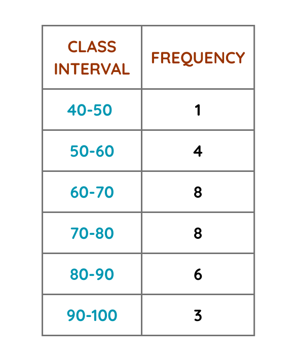
Step #2: Let us now draw the respective histogram by the help of frequency table.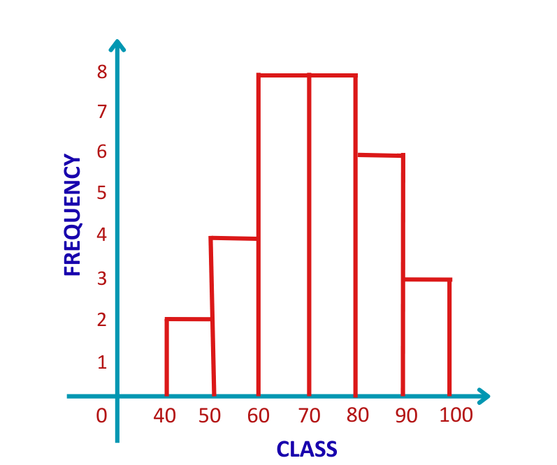
Solved Example:
Problem: A store recorded daily sales (in $) for 20 days:Create a histogram and analyze spending trends.
[120, 85, 150, 200, 95, 130, 180, 75, 160, 110, 140, 90, 170, 105, 125, 115, 155, 80, 190, 100]
Solution:
Step #1: We will firstly make the Frequency table: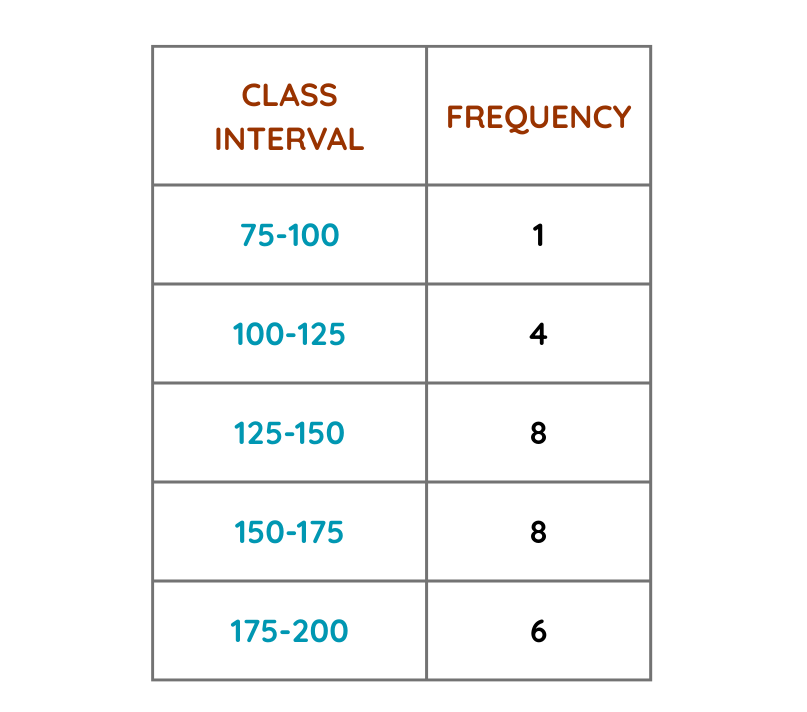
Step #2: Let us now draw the respective histogram by the help of frequency table.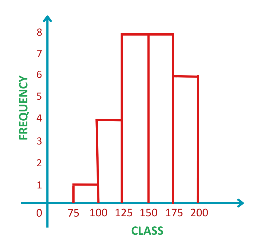
Solved Example:
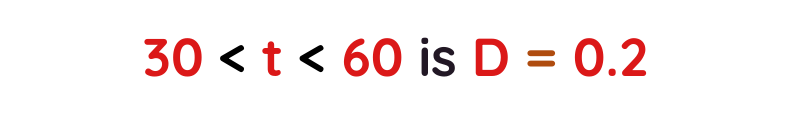
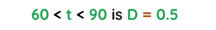
Problem: The histogram below shows information about the time tt seconds taken for students to complete a 400m race.
How many students ran 400m in under 90 seconds?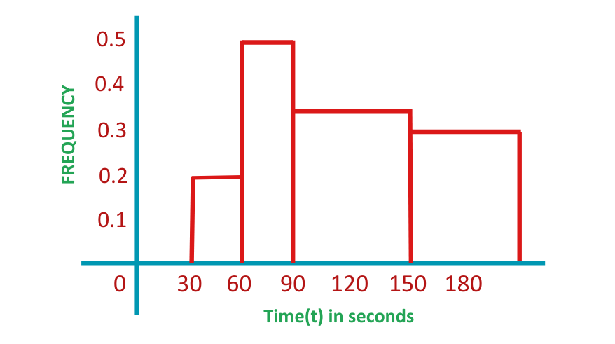 Solution:
Step #1: Locate the frequency density for the class interval(s).
- The frequency density for the class interval
- The frequency density for the class interval
Step #2: Determine the class width for the class interval(s).
- The interval 30 < t < 60 has a class width

- The interval 60 < t < 90 has a class width

Step #3: Use the frequency density formula to determine the frequency.
To calculate the frequency in both of these class intervals, we must work out the frequency in each class separately, then add them together at the end.
The frequency density formula is As D=0.2 and W=30 for the interval 30 ≤ t < 60,, we can substitute these values into the formula and solve for Frequency.
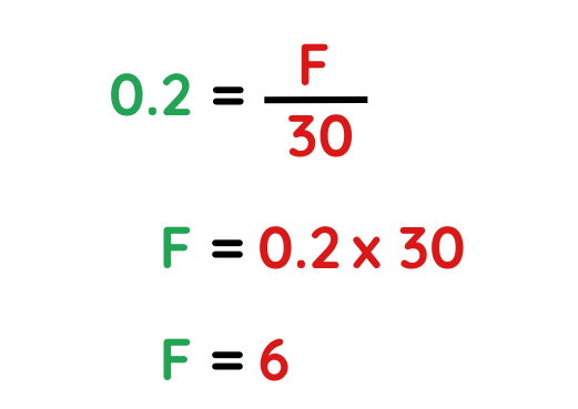
As D=0.5 and W=30, for the interval 60 ≤ t < 90, we can substitute these values into the formula and solve for Frequency.
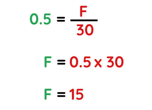
The frequency of students who ran 400m in under 90 seconds is-
15 + 6 = 21 students.