Cumulative Frequency and Box Plots and Step-by-Step Examples
Cumulative Frequency and Box Plots
- Cumulative Frequency and Box Plots belong to the most significant statistical tools which show the prevalence and degree of the variation of data.
- Data visualization turns the raw data into simpler formats, thus way increasing comprehension and showing tendencies that perhaps cannot be shown in the data.
In this article, we will discuss:
- Understanding Cumulative Frequency and Box Plots
- Steps to Construct Cumulative Frequency
Here is one more link to practice a few extra questions: Maths Genie Cumulative Frequency and Box Plots Questions
Understanding Cumulative Frequency
- Cumulative Frequency refers to the summation of frequencies in a taken dataset. It assists in getting insight into the spread of data values in various bins.
Cumulative Frequency Curves:
- The cumulative frequency graphs are examples of cumulative frequency distributions represented graphically. The curve gives a vision of the nature of data and how it is spread.
Steps to Construct Cumulative Frequency
Steps to Construct Cumulative Frequency:
- Step #1: Group Information: Arrange information from smallest to largest or vice versa.
- Step #2: Set up the Frequency Table: Sort the data values according to their occurrence frequency.
- Step #3: Add up: List all the frequencies as you move on with the list.
Understanding Box Plots
- Box plots, which are often known simply as box-and-whisker plots, display the distribution of a dataset in an easy-to-read manner.
- They demonstrate the median, quartiles, and also possible outliers.
Components of a Box Plot:
- Box (Interquartile Range): Represents their respective quartiles.
- Whiskers: Among others, such a module can be used for the minimum and maximum values within a given scope.
- Median Line: Divides the data into two parts with an equal number of observations in each part, namely, the upper half and the lower half.
- Outliers: Points away from the thinnest point at the whiskers.
Construction of Box Plots:
- Set the quartiles and interquartile range.
- Plot the box, whiskers and median line accordingly when the data is graphed.
Practical Applications
- Identifying Skewness:
- Cumulative frequency graphs with the help of which we can figure out the dataset’s skewness – positive or negative.
- Comparing Distributions:
- The comparison of distributions when data sets are analyzed is done by using box plots, which show a summary of distributions.
- Detecting Outliers:
- Box plots can emphasize possible outliers, hence, they help to identify the featured data points which are significantly above the norm.
Solved Example:
Question 1: Imagine, two data sets that are of student scores per group calculation. Witness the creation and comparison of both frequency tables and box diagrams.
Solution:
- Step #1: Accumulated Frequency Tables
Set up a site for each grouping, keying in collective frequencies at each interval.
- Step #2: The Cumulative Frequency Curves.
Provide the cumulative frequency curve for both groups to observe the disparity in the dispersion pattern.
- Step #3: Box Plots
For each data set determine, as a calculator, quartiles and produce box plots to show the spread and central tendency.
Conclusion
- Cumulative Frequency and Box Plots are irreplaceable tools in a statistical analysis that makes it possible to obtain the insight about datasets parameters.
- Cumulative Frequency calculates the distribution of data over intervals which is convenient for its visualization, while Box Plots provide a succinct summation of central tendencies and variations.
- Through practical applications and a solved example, this blog has demonstrated the significance of these tools in exploring and interpreting datasets.
Practice Questions:
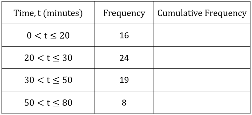
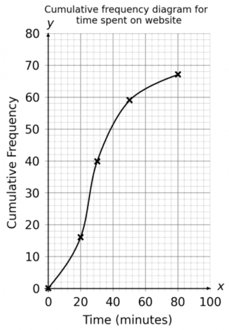
Question 1: Given is a frequency table depicting the time individuals spent on a specific website in one day. Your task is to complete the cumulative frequency column in the table.
(a) Complete the cumulative frequency column in the table above.
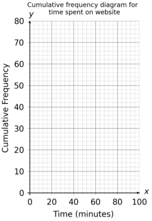
(b) Given the data from the table, plot a cumulative frequency graph on the provided axes. Cumulative Frequency graph
Solution:
(a)
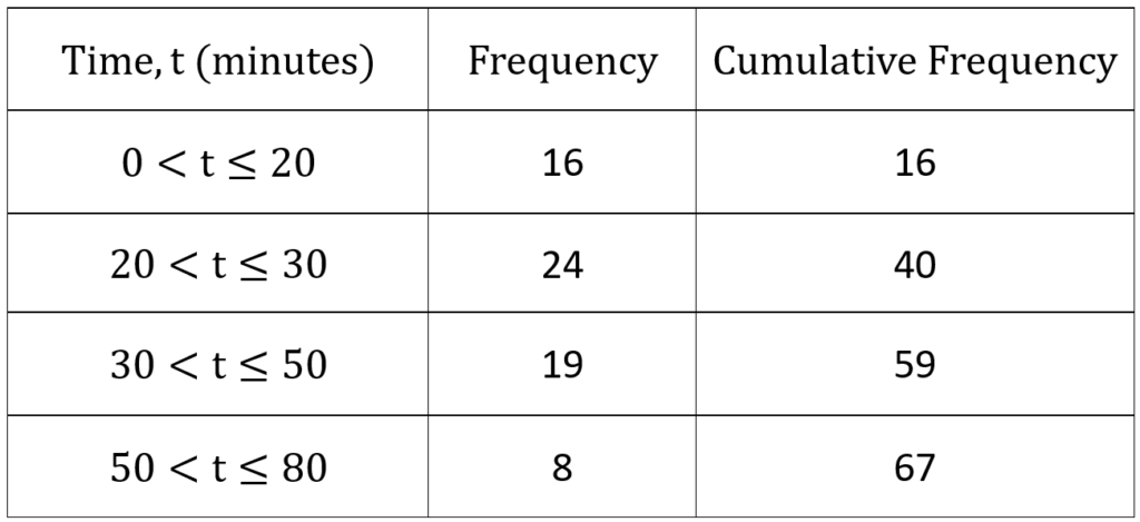
Step #1: Begin with the initial cumulative frequency(cf) box, which is 16
Step #2: Move on to the second cumulative frequency box. Sum 24 with the preceding cf (16):
24 + 16 = 40
Step #3: Proceed to the third cumulative frequency box. Add 19 to the previous cf (40):
19 + 40 = 59
Step #4: Continue this process iteratively until the cumulative frequency column is filled.
The finalized cf table appears as follows:
(b)
Axis Setup:
-
- Place time in minutes along the x-axis.
- Plot cf totals on the y-axis.
Data Points:
-
- For each cumulative frequency figure, find the corresponding class interval maximum.
- Example: For the time interval 0 – 20 minutes, locate 20 minutes on the x-axis (maximum in this range) and move upward to the cumulative frequency value of 16
Origin plotting:
-
- Ensure to plot the origin (0,0)
Curve Drawing:
-
- Join all plotted points with a smooth curve. A cumulative frequency graph always forms a smooth ascending curve.
Question 2: The weight of 80 deer was recorded by a zoo keeper. The table below shows this information.
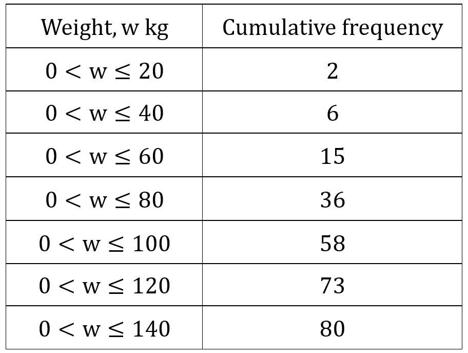
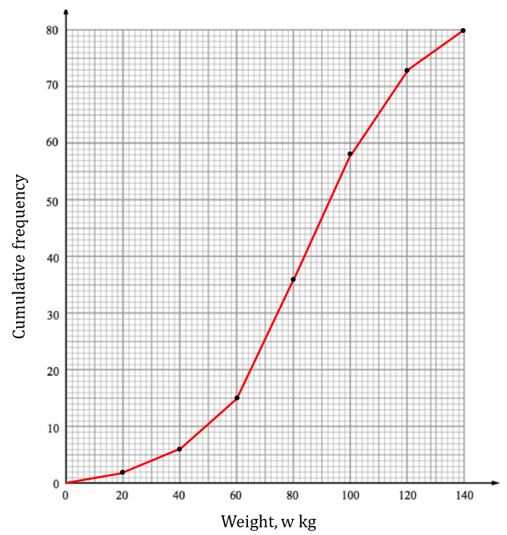
Draw a cumulative frequency graph for this information.
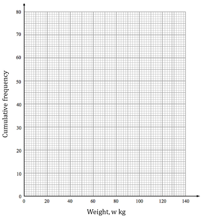
Solution:
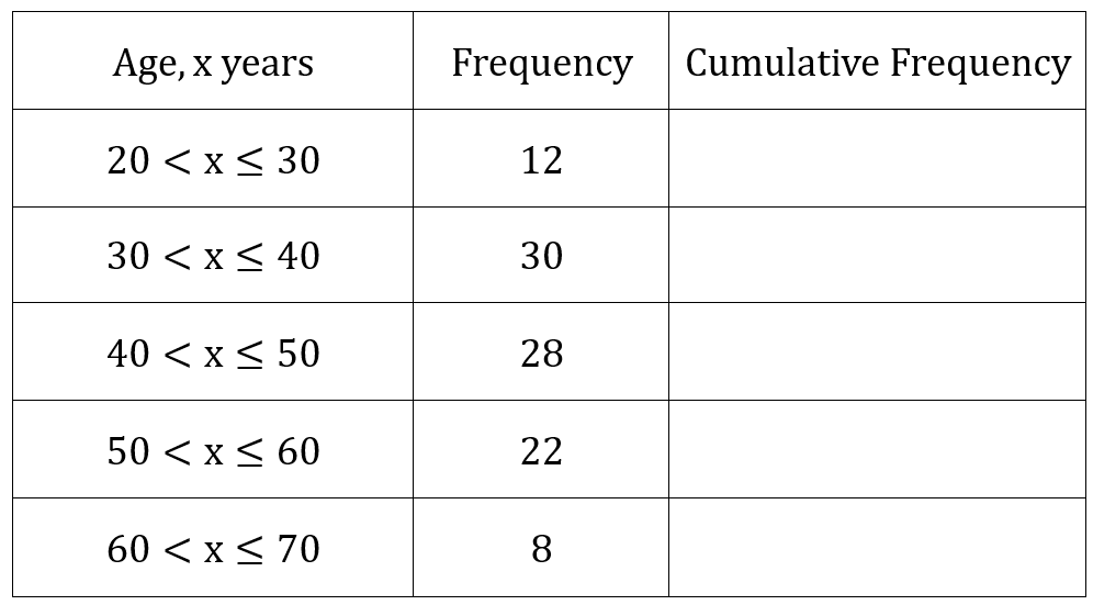
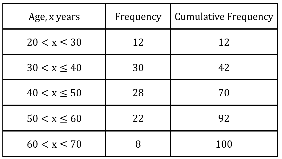
Question 3: The ages of 100 women were recorded. The table below shows this information.
(a) Fill in the cumulative frequency column in the table.
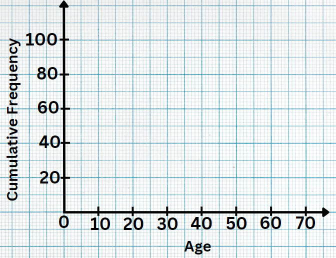
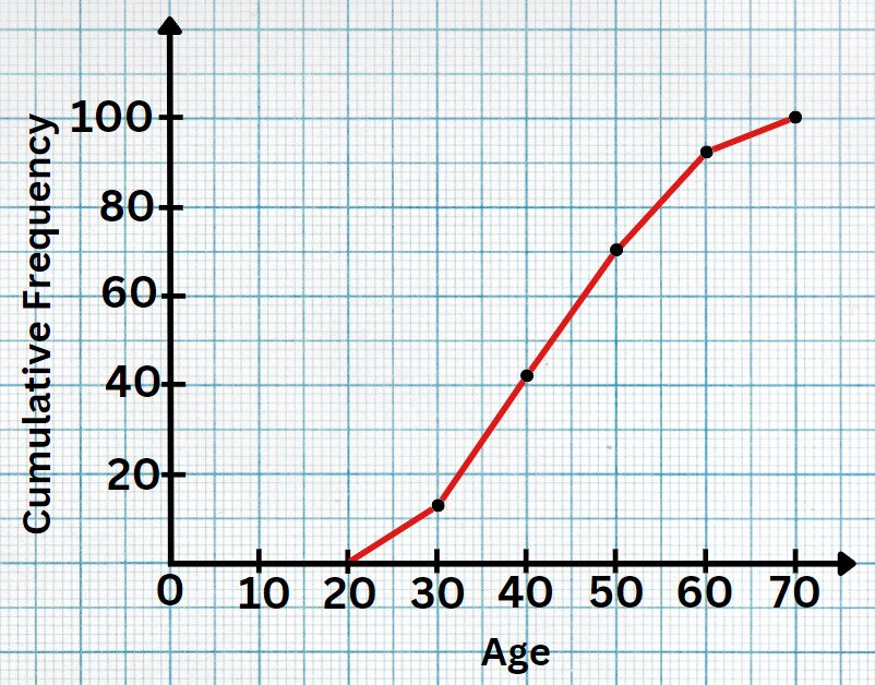
(b) Create a cumulative frequency graph based on this data.
Solution:
(a)
(b)
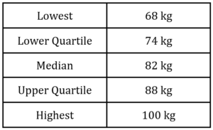
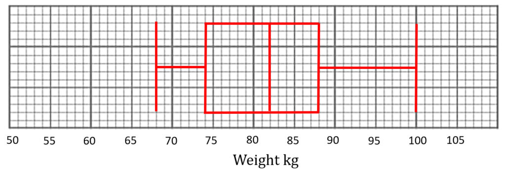
(a) Illustrate a box plot to represent this data.

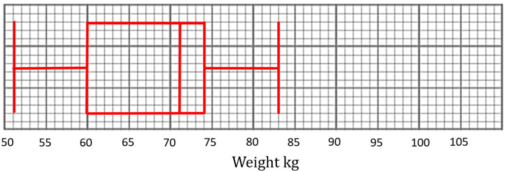
The weights of 50 female football players are also recorded.
The lightest female football player is 51kg.
The lower quartile is 60kg.
The median is 71kg.
The range and interquartile range for female football players are the same as
the male football players.
(b) Create a box plot to represent this information.

(a)
(b)
